Mini Websites: The Swiss Army Knife I Never Knew I Needed

I'll never forget the day my friend Alex called me in a panic. "I need to promote this indie band concert, but I don't have time to build a full website, and social media posts just aren't cutting it!" That's when I introduced him to the concept of mini websites—and honestly, it changed his event planning game forever.
Mini websites have become my secret weapon for all sorts of projects. They're like digital business cards on steroids—compact, focused, and surprisingly powerful. After creating dozens of them for various purposes, I've discovered they're especially brilliant for events. Let me walk you through some real-world ways I've seen them work magic.
When My Buddy's Band Finally Got Noticed
Remember Alex? His indie band showcase was struggling to gain traction until we built a simple mini site in just one afternoon. We included:
- Short artist bios with personality
- Sample tracks that actually played without buffering issues
- A dead-simple ticket purchase button
- Some candid rehearsal photos that showed the vibe
The result? They sold out their venue for the first time ever. The mini site gave potential attendees everything they needed in one clean, focused place—no scrolling through cluttered social feeds or hunting for information.
"People kept telling me they loved having all the info in one spot," Alex told me afterward. "And the ticket sales jumped right after we shared the link."
How I Saved My Birthday Party (And My Sanity)
Last year, I decided to throw myself a themed birthday party. Initially, I created a Facebook event and sent some texts, but the questions started flooding in: "What should I wear?" "Can I bring a plus-one?" "Where exactly is this place?" "What time should I really arrive?"
I was drowning in DMs until I spent 30 minutes creating a mini website with:
- A map with parking tips (this alone saved me from answering the same question 24 times)
- Photos from the venue
- A clear explanation of the loose "1980s casual" dress code
- A simple RSVP form that collected dietary restrictions
Not only did the questions stop, but people actually showed up on time, appropriately dressed, and excited. One friend even mentioned, "I felt like this was going to be a good party just from the site—it showed you cared about the details."
The Family Vacation That Didn't Need a Group Text
My extended family's annual vacation used to involve endless group texts with flight details, accommodation information, and activity suggestions. It was a nightmare of "Wait, what time are we meeting again?" and "Can someone resend the address?"
Last summer, I created a mini travel site instead. I included:
- Our day-by-day itinerary (that everyone could reference without asking me)
- Weather forecasts for our destination
- Packing suggestions based on our planned activities
- A shared photo gallery that automatically updated as family members uploaded pictures
My aunt, who's typically technologically challenged, told me, "This is the first family trip where I actually felt like I knew what was happening each day." The mini site became our digital home base, and I swear it prevented at least three family arguments.
The Workshop That Actually Filled Up
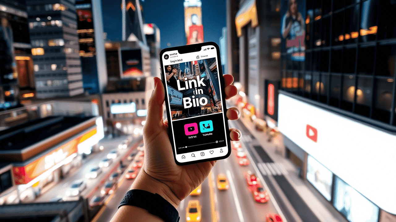
My colleague Jamie runs photography workshops but struggled with low attendance until she created a dedicated mini site for each session. Instead of just posting on Instagram with a "link in bio," she built a focused page that:
- Showcased before/after photos from previous students
- Clearly outlined what equipment participants needed
- Included testimonials from past attendees
- Offered a simple sign-up process
"The difference was night and day," she told me. "People could see exactly what they'd learn and what to expect. My workshops went from half-empty to waitlisted."

The Fundraiser That Exceeded Its Goal
When my local animal shelter needed emergency funding, I volunteered to help with their digital presence. Instead of just creating a GoFundMe link, we built a mini website that:
- Told the stories of specific animals who needed help
- Showed a real-time progress bar toward our goal
- Listed exactly how donations would be used
- Made it easy to share on social media
We raised 143% of our target amount. The shelter director was convinced that the mini site's focused storytelling made all the difference. "People could connect with the actual animals," she said. "It wasn't just an abstract cause anymore."
The Product Launch That Actually Felt Professional
My startup friend was launching a new app and was stressed about making a good impression without a massive marketing budget. We created a mini website that focused solely on the launch event:
- A countdown timer that created urgency
- Sneak peek videos of the app in action
- Profiles of the founding team
- Press materials that journalists could easily download
"It made us look twice our size," he admitted later. The focused approach allowed his small team to appear much more established, and they secured coverage from two tech blogs they'd been targeting.
The Wedding That Guests Still Talk About
When my sister got married, she was overwhelmed by the logistics of communicating with guests. Her mini wedding website became command central for:
- The full event schedule with locations
- Accommodation options for out-of-town guests
- Their registry information
- A form for submitting song requests to the DJ
"It was the best planning decision we made," she told me. "And guests loved the song request feature—it made everyone feel involved in creating the celebration."
Why Mini Websites Work So Well for Events
After creating and observing dozens of these sites, I've realized their power comes from their limitations:
- They force you to focus on what matters. You can't include everything, so you prioritize the essential information.
- They load quickly. No bloated code or unnecessary features means visitors get what they need fast.
- They're purpose-built. Unlike social media, where your event competes with endless distractions, mini sites keep visitors focused on your specific event.
- They feel special. Creating a dedicated space for your event signals to attendees that this isn't just another Facebook invitation—it's something worth paying attention to.
Getting Started Is Easier Than You Think
The beauty of mini websites is that you don't need to be a tech wizard to create one. I've helped friends with zero coding experience build effective event sites in under an hour using simple tools.
The key is to start with your visitor's most pressing questions: What do they need to know? What will make them take action? What concerns might prevent them from attending?
Answer those questions clearly, add some personality, and you've got yourself a mini website that works harder than most full-sized sites I've seen.
So the next time you're planning an event—whether it's a massive conference or an intimate dinner party—consider creating a dedicated mini website. Your attendees will thank you, and you'll save yourself from answering the same questions over and over again. Trust me, your sanity is worth it.


